Check out PsychoKid!!
Check out the PsychoKid cartoon link now!!
and be the first to strangle him till he *cough cough...
it's E V I L ~~~~ Hwahahaha....
Check out the PsychoKid cartoon link now!!
Assignment 4...
 got this idea when i saw my collection of "toys", haha models to be exact... well nowadays kids play with PSP, PS2, online games and stuffs, so where will all these toys go to? what a sad ending... lets work together to save them!!! but i was tied down by my computing and just spent about 4 hours on this and couldn't really focus on it. it turned out quite pathetic actually and i'm not very satisfied with it. sad...
[comments: toys too small, header too small, font not conveying message, web too big became main focus. add lines to make the picture look 3D at a room corner, hang toys on web, change font type]
guess i'll have alot to do this timr round... need alot of improvement man...
erm... under construction... i cant get all the pictures into one post like i said i'm a blog idiot... working on it... haha...
well i did some adjustments for my angels and this shld be more or less the final product... halo remains same size for 2~3, head same size, eyes same size, girl to girl instead of girl to boy, as for from 4 onwards, i took out all the details of the wings...


Assignment 2... choosing an object and creating its indexic picture. I've chosen "Angel" here 'cos it's sort of a imaginary figure so i can draw it in whatever way i wan? haha... so here goes...
 this was what i had for my presentation.
for this, i basically re-do everything. i redrew my ultraman and monsters with brush-like outlines and add in highlights. however one problem, from one look its quite hard to tell its "kayv" eh? so i tried something funny......
 this was the something "funny"... but it kinda screwed the picture... bad...
 [T.A: you tried TOO hard]
Erm... i couldn't post this together with the previous post cos i keep getting errors dunno why... too long it states... @#$%^&^%$... anyways i'm still at the first tutorial here...
 << well i thought that by creating my own characters, they shld still be considered as cartoon characters right? so came my monkeys!! i like this one 'cos the colors are light and clean. gives a peaceful feel. not much comments from class.
First tutorial we were supposed to present of drawings of our loves and hates. however i din know if our sketches are to be in digital or print so i did it in digital format. and also, we were supposed to choose one design from each word and work on it but i couldn't really make up my mind so i did 2 designs from each word instead... here goes...
 << nutting special about this, but the characters looks quite nice i though... but from here due to the resolutions error that i made it looks quite messy...
 <
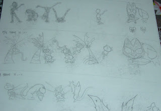
<erm did a sketch in class but din really used it in the end 'cos its kinda messy. this is the third time i'm trying to post this thing so i'm gonna keep it short 'cos blogger screwed up on me the last 2 times... or mayb i'm just too much of a blog idiot... haha... anyways...
 This sketch was so messy that i did not use it for my digital drawing. instead i did a new sketch using my comp itself.